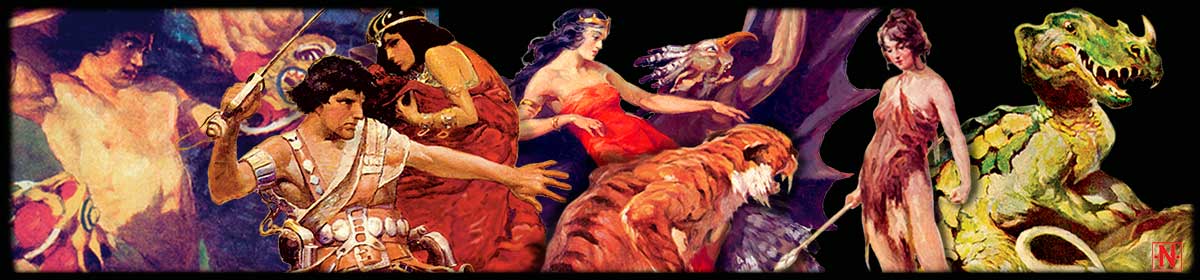

Click on any graphic to see a full-size scan.
As new technologies come into acceptance, old technologies not only die, they’re forgotten, ignored and misremembered. Common knowledge becomes fuzzy—seen in the rearview mirror of memory it is soft-edged and reversed. These days “benday dots” generally refers to color printing in comic books and Roy Lichtenstein’s paintings, but few realize what a detailed and time-consuming process it was and what creative possibilities it had.
Hal Foster, describing the Prince Valiant color proofs in the collection at the University of Syracuse, said, “Those first engravings were beautiful things. They had Ben Day process then and those Ben Day men were artists—they could get the colors. Then they got cheaper and cheaper and now [1971] finally there’s no Ben Day work at all now. They use a different process that’s cheaper and not nearly so good.”
Foster appreciated the Ben Day men, and in 1931 it was the Ben Day men, who made the color separations for United Features Syndicate and the Tarzan Sunday strip, and they continued to use the same methods to color the panels for at least the next decade and a half—just as they’d done since the 1890s.

So what exactly was the Ben Day process? Invented by Benjamin Henry Day, Jr. (1838–1916) son of printer Benjamin H. Day, founder of The New York Sun newspaper in 1833, it was the primary method used to add shading to line engraving for letterpress printing for almost a century. Ben Jr. had gotten drawings reproduced by Currier and Ives and was known as a political cartoonist during the Civil War. His brother was Clarence Day, subject of “Life with Father” written by Clarence Day, Jr. The Ben Day process, also known as “tint laying,” used the Ben Day Shading Medium patented in 1878 as a way to add clean tints and shades to chromolithography, something that was originally done with pen and ink. The tints were patterns of dots, lines and stipples laid on the lithographic stone with ink which, once dusted with a chemical powder called “dragon’s blood,” and heated, was impervious to water and would form a part of the final, etched, printing plate. This specialized job required extensive training. By 1900 Ben Day Shading was used consistently in letterpress printing as part of the photoengraving process for both black-and-white and color work, in both illustration and advertising.

To print a Sunday comic strip, the original line art first had to be sent to the engraver and photographed to size. The artwork on a full page Sunday strip could vary slightly by artist. Foster’s Tarzan originals from 1933 are about 20″ x 27″, Raymond’s Flash Gordon with a Jungle Jim topper measured 24″ x 31″ in 1936, and a Hal Forrest Tailspin Tommy of 1937 was 22″ x 29″. All had to be reduced to the then standard broadsheet page, about 13.5″ x 18.25″ or 67% of the original. From the camera negative four zinc plates were made, one for the black line art (the key plate, exposed and etched in the usual way) and one each for the three process colors of yellow, red and blue, showing the line image photographically exposed, in reverse.
A black and white positive of the line art was then sent to the original artist or the syndicate to use as a color guide. Some artists took charge of coloring the proof themselves, but evidently there were “colorists” in the syndicate production flow who also did them, at least early on. Surviving color guides are the same size as the printed art before 1930 and smaller than the final print after that. A 1925 R. F. Outcault Buster Brown color guide seen at Heritage Auctions is 14.75″ x 18.5″ and a 1938 Chester Gould Dick Tracy guide is only 9.75″ x 12.5″ though Gould’s original art from the same year is 19″ x 26″. Photostat machines were in use by 1912 and were able to enlarge or reduce up to 3 copies per minute. The Rectigraph was another photocopying camera which also produced fast enlargements or reductions. Either of these could have been used to produce the proof copy used for the color guide.

The photocopied proof was then painted with water colors using the three primaries with a limited set of their tints and shades. Regular pan or tube water colors were used before the more vivid Dr. Ph. Martin’s liquid water colors became available in 1934. Comic strip color was restricted to combinations of the primary colors and one or two tints of each, because of the time it took to produce the plates for separation. Any special coloring instructions were usually written directly on the color guide. Any gradations were to be indicated by washes.

Though we’re familiar with the tint codes used with coloring in the comic book field (the Chemical Color Plate chart is posted all over the web, dating from around 1960 or 1970), I found no information on such codes specifically for Ben Day work. Apparently, up until the late 30s or early 40s, the Ben Day men determined for themselves how to build tints using a few densities of screens no higher than 65-line (65 dots to the inch). This ability to calculate the screens needed to build a color was the mark of a superior Ben Day man. The earliest extant color guides I could find are for a Buster Brown page from 1923 and a Tailspin Tommy from 1930. Both have written instructions to the Ben Day men giving them the same simple color choices. Obviously any printed color builds on the printed comics are the work of the engraving department.

Before the tint laying could begin, however, the plate had to be prepared by blocking out the areas where no color was required. That was done with a thin, yellow-colored water soluble gum called “gamboge” painted over the image of the line art on the exposed plate. This acted as a mask to protect the plate from any accidental marking when the tint was applied.
The Ben Day man referred to the color guide and decided which combinations of pattern would create the requested color. If a light orange color was needed on a chair, for instance, a solid yellow and a tint of red were required. On the plate to be used for the red, any area that didn’t use the tint would be painted over with gamboge, using the line art to define the space. If a light purple color was required in another area and the same tint of red could be used, that area would be left clear as well. In other words, any area that would include that tint of red would be left alone and any area that did not use it would be blocked. The yellow and blue plates would also have to be matched their corresponding solids and tints.

Ben Day patterns, of which there were around 200, were actually embossed on a celluloid film or gel which came in sizes from 5.5″ x 6.5″ up to 13″ x 16″ depending on the pattern. The back of the film was smooth and was sometimes lubricated lightly with vaseline or a mixture of benzine and wax polished with a flannel cloth before use. The film was inserted into a holding frame, then attached to the adjusting mechanism, usually termed a “Holdfast,” though a slightly different “drawing board apparatus” was used for working on zinc, and positioned over the printing plate to make sure it was in the correct position. Then the film frame was removed from the apparatus and the film inked, with an acid-resistant ink, on a separate pad with a roller. A light touch was needed so as not to over-ink or get ink into the valleys of the emboss, but enough ink was required to make a clear pattern on the stone or plate. Once the film was inked, the frame was reinserted into the device.

The tint layer then used a small roller or stylus to gently press the back of the film bringing the inked, downward facing side against the plate to leave the pattern. This was a delicate operation requiring a firm but light hand, not bearing down on the film but only using enough pressure to leave the ink pattern on the plate without distortion.
The Holdfast not only kept the film frame securely in position, it was equipped with small adjusting micrometer wheels which would allow the film frame to be shifted vertically or laterally, no more than a thirty-second of an inch, in order to make the dot pattern heavier or thicker. A doubling of the pattern in one area could create the effect of a shadow or a darker tint to modify the color. A nice gradation could be made by shifting the pattern to increase the dots along a line as the tone got darker. This was the preferred method of getting another tone so as to reduce the time spent in changing pattern films. The film would still have to be removed from the frame after each use and re-inked so the ink dot would be as clean and sharp as possible before the next work area could have the tint applied to it.

Solid color areas were painted directly onto the plate with the acid-resist ink. Because of the limitations of process ink formulations for newsprint, care had to be taken that no more than two solid color areas would overprint, or lay on top of one another, otherwise the ink would begin to offset to the plate instead of the sheet as it ran through the press.
The Ben Day man had to have a steady hand and had to “color inside the lines” when applying the gamboge. He had to be able to figure out which tints would produce the color needed by controlling where they lay on each plate. And he had to make sure that the screen dots would not create an unwanted pattern (a moiré) when printed. No wonder it could take a week to work on just one full broadsheet Sunday comic page and the artist had to keep eight weeks ahead on the art!
Once the plates were ready for the etching bath, the gamboge was washed off with water and the line art image removed. The ink of the Ben Day pattern was burned in after being dusted with the “dragon’s blood” powder and the plate was passed on to the etcher. Finally, a color proof would be pulled on a proofing press and sent to the syndicate editor for approval.

Most Sunday strips from the same period are separated using the standard dot patterns. This blow up of an Ella Cinders panel from 1931, a strip owned by Metropolitan Newspaper Service and then by UFS after the merger, is smoothly done with only the slightest indication of a shifting of the Ben Day film.
The fascinating thing about the Tarzan Sunday pages is that the tones are not just simple applications of mechanical stipple patterns, but use multiple manipulations of the shading film as well as a hand stipple in the yellow area. This is forcefully apparent in the Dark Horse Books Tarzan Sundays collection on the page for September 25, 1932, “Through the Cavern’s Mouth.” On that sample it is clear that the red and yellow plates have been accidentally switched by the printer, creating a red flashlight glow and a red loincloth for Tarzan. In every panel of the page we can easily see the stipple pattern that was intended to be the yellow plate.

Close inspection of the original tear sheet, using a loupe, shows that the dots found on the red and blue plates have been shifted to create lines in some areas causing wonderful transitions and builds. Adjusting the hues and saturation in Photoshop reveals the stipple pattern for the yellow plate. It’s very hard to see the pattern without this kind of digital augmentation. Looking at the printed tear sheet the color is simply a light yellow and it might even just look faded. But this stipple pattern confirms that the business of laying tints could be a creative endeavor.

In Frank F. Greene’s comprehensive textbook from 1941, How to Create Cartoons, a complete description of the Ben Day process used at that time shows the three most commonly used patterns. Among them is the hand stipple pattern used in creating the color separations for the 1932 Tarzan pages.
So, who did all this work? World Color Printing and Eastern Color no doubt had their own photoengraving departments. But we know that Strauss Color Engraving was the photoengraving contractor for King Features, at least on Prince Valiant, and Koppel Photo Engraving Co. handled the color separation chores for the Chicago Tribune on Dick Tracy as well as Harvey Publishing and Fawcett Comics. What other photoengravers were contracted to the syndicates and what artwork, color guides and proofs passed through their hands? This area of comic production enquiry has not been explored, as far as I know. Probably it’s too late to get many answers about this aspect of the field, but it might be worth looking into if there are any Ben Day men still around.
After the plates were engraved and approved, they were sent to the matrix department and were used to cast paper molds called “stereotype matrices” or “mats.” Mats are impressions of an original type-set page or a metal “cut” of artwork pressed into a damp papier-maché-like material called “flong” to make a mold. (BTW, the word comes from the French word “flan” meaning “custard,” just like in Spanish!). When dried, they are light-weight, flexible and a lot less expensive to send out than a full size zinc plate. In addition to holding the contracts with the artists and the rights to the comic characters, the syndicate supplied these stereotype mats of artwork and color separations to the newspapers that subscribed to their services. Four mats to a page: one for the line art and one for each of the process colors. The newspapers put the mat into a “casting box”, and poured hot metal into the mold to create a curved stereotype plate for printing on their own rotary presses. On his wonderful site, The Print Guide, Gordon Pritchard has a page explaining the production and use of the stereotype. Take a look at it and, if you’re interested in printing processes, spend a little time going through his posts.
Not all newspapers had four-color presses in the 1920s and 30s. Those that didn’t contracted out to four-color printers, like World Color Printing and Eastern Color Printing, who received the mats and printed Sunday supplement sections for them. Some syndicates maintained their own presses, or worked with outside color press shops directly, to provide individualized color sections with the subscribing paper’s flag in place at the top. In many cases the color printing shop also handled the production work of making the color separations. Hearst’s Puck, The Comic Weekly printed over 5,500,000 copies distributed by seventeen papers in their group in 1936. The same year the Metropolitan Weekly, from the Patterson-McCormick chain, the Chicago Tribune Syndicate, with twelve newspapers, including The Chicago Tribune and New York Daily News, distributed 6,250,000 copies each week. Newspaper comics were big business in those days.

“Benday” eventually became generic for mechanically applied dot patterns. There were other ways to do the mechanicals for comic color and they gained in prominence as the years went on and deadlines got tighter, particularly in the comic book world. Many shading screen products were invented, patented and sold, from as early as 1907 through the 50s and later, to compete with the original Ben Day process. Bourges, Craftint, Fluorographic, Kromolite, Contak, and others were alternatives allowing the artist to have more control over the shading of his drawings. The Tarzan color tints from the 1940s look very much like what was probably a Craftint product. But Ben Day was the standard for direct-to-plate work for letterpress for almost 100 years, particularly in the newspaper comic field and for line art in advertising.
The Ben Day men were the grandfathers of today’s digital colorists. You can’t really understand how and why the early newspaper comics looked the way they did without knowing something about the process. Some people loved it and some hated it. It was slow, difficult to learn and as much an art as a craft. There were guys who could do it right and there were guys who just did it as a job. Nowadays the comic colorist does his or her work on the computer and controls the effects with digital blends and a far wider range of hue than was ever possible in the Sunday comics. We’re all glad that we don’t have to trust the color to someone else, no matter how dedicated he might be. But the next time someone looks at a reprint of an old comic strip and says, “Look at those benday dots, will ya?,” you’ll know what went into making them and you’ll be able to spare a sigh for the old Ben Day man who did his best.
This article identifies the brother of Benjamin Henry Day, Jr. incorrectly as the author of LIFE WITH FATHER. Clarence Day (1844-1927), Benjamin’s brother, was the subject, not the author, of LIFE WITH FATHER, which was written by his son, Clarence Day, Jr. (1874-1935). I learned of the article through the blog of Mark Evanier, who may also be aware of the error.
Thanks for that correction Daniel. I updated the article to reflect that information.
I have long been interested in all aspects of newspaper comics and their offshoot, comic books. But I knew almost nothing about their actual production. Thanks for the great behind-the scenes info. By the way, I did recognize the name Jack Adler who was a long-time employee at National/DC. Right?
Hi Henry, Thanks for the comment. Yes, Jack Adler was Production Manager at DC. There is a wonderful interview with him and Sol Harrison, VP of Operations, in “Amazing World of DC Comics” #10, where I picked up the bit about him making color seps for the early Prince Valiant strip. I wrote this article because, although there are a number of pieces on the web about coloring comic books, I thought someone should look into the earlier production methods for Sunday comic strips. In all the books I’ve read about strips, there is a lot of writing about the cultural meaning of comics, the histories of the strips and artists themselves, but very little about the workings of how they got printed. Too technical and boring for most readers, I suppose. Except for folks like you and me, right?
This is realy interesting. Amazing process, actually.
Great post! An interesting follow-up would be to note when some comic books switched from the Craftint method to hand-cut Zipatone. Some colouring ‘pros’ don’t know the history of their own art/craft!
http://www.dave-co.com/gutterzombie/viewtopic.php?f=3&t=441&p=4417&hilit=process+artifact#p4417
Nicholas, thanks for your comment.
I enjoyed your linked post. The materials you mention were indeed produced by Craftint way back in 1934 and were called “Craftint Multicolor.” They were available in either board or film form. The process worked exactly as you described it, using the Craftint Developer liquids that were also sold. Based on the same system as Craftint’s “Singletone” (1929) and “Doubletone” (1932) boards, Multicolor even had each film specified as to whether it was to be used as the yellow, red or blue plate — they were set up to print at the correct angles. And they were available in either positive or negative forms depending on the printer’s requirements.
I think this is what was used on the Burne Hogarth Sunday pages.
My research has found two great sources for this kind of information: “The Eighth Graphic Arts Production Yearbook” (1948) which you should be able to find as a PDF online, and “Printing Progress, A Mid-century Report” (1959) by the International Association of Printing House Craftsmen Inc., Cincinnati, OH. I tell ya, you have to dig deep to ferret out this stuff!
As I mention in the post above, a lot of this production work was handled by different photoengraving houses and it’s difficult to know exactly who used what process to prepare the color separations. I used the Fluorographic process (gray paints of different percentages on acetate overlays) on some jobs I did in the early 1980s, but I don’t think you can even get the materials anymore. Now that printing has moved into the 21st century these arcane production methods are as mysterious to most people as turning lead into gold.
Hi Phil,
Amazing you posted this. My studio research for my MFA is titled ‘Locating the dot’ and Ben Day was/is a prodominant component. I chance meeting the 92 year old Sydney lithography Raymond Sim revealed the process and one of the screens you have described: http://www.flickr.com/photos/minigraff/8487490643/
thanks, Wendy
Thanks for the photo link, Wendy. Best of luck with your MFA. Let us know how it goes.